SI Eats
One of the coolest and most challenging assignments of my internship at Sports Illustrated was creating a logo system for SI’s newest vertical, SI Eats. I had to work with the constraints and limitations of designing within SI’s brand, while still coming up with something that had a totally different feel to match the unique angle of food and sports that hadn’t yet been included in SI’s brand.
Step one:
Drafting
The final logo concept didn’t come quickly. I spent several days doing design sprints, where I created tons of digital drafts for several different concepts, and then presented them to SI’s design director, special projects editor and product team to gather edits. From there, I refined the better concepts, and executed new ideas that they gave me. Below is a small sampling of logos created during the process.
Step two:
Refining
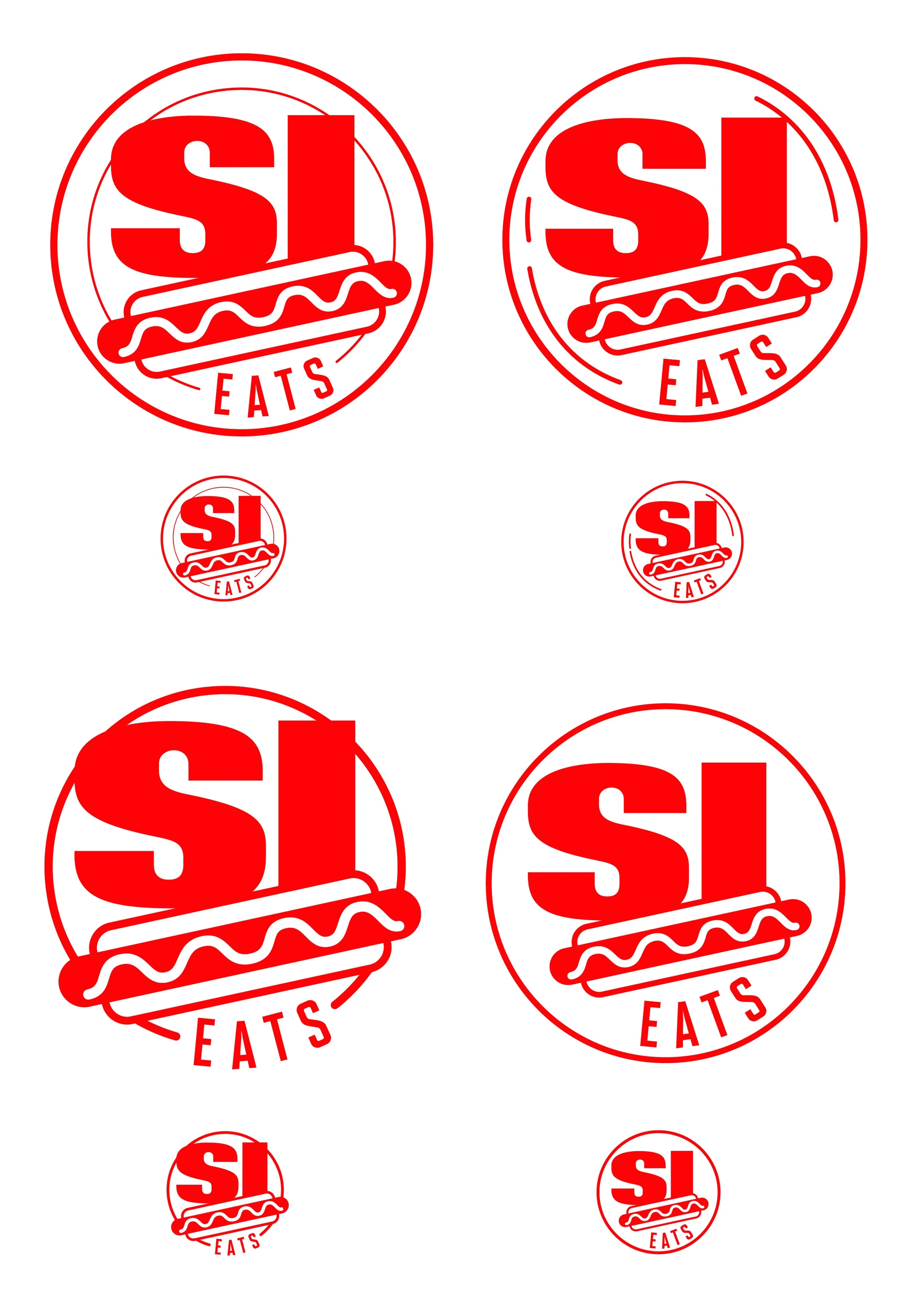
After two days of exploring crazy ideas, we narrowed in on a concept that we all liked. From there, I refined four possible versions for the team to choose between, and presented them at different scales. This helped us to get an idea of what would be most effective on the various different platforms where it would be displayed.

The Final Logo
Once we agreed on an icon version of the logo, we made a slight color change, and I created a horizontal version of the logo with its tagline that could be used on the desktop and mobile banners on the SI Eats webpage.
The logo continues to be used in print as well in a weekly front-of-book feature for the magazine.

